My Role
As the lead designer on the Enterprise team, I led the design the Airtable’s new data management surface called Field Manager. This project was highly complex so I collaborated closely with cross-team product managers and engineers to understand Airtable base functionality, navigated technical constraint conversations, and refined the experience throughout internal dogfooding.
Problem & Business Impact
Many Enterprise customers choose Airtable because of their capability to provide a powerful visual database that connects complex data and workflows. However, an important aspect of creating and maintaining complex workflows is the ability to understand and manage (at scale) the impact of your changes.
Airtable’s product needed to be optimized to provide increased visibility into these relationships, especially in more complex databases.

Example of base relationships within Airtable
The Solution
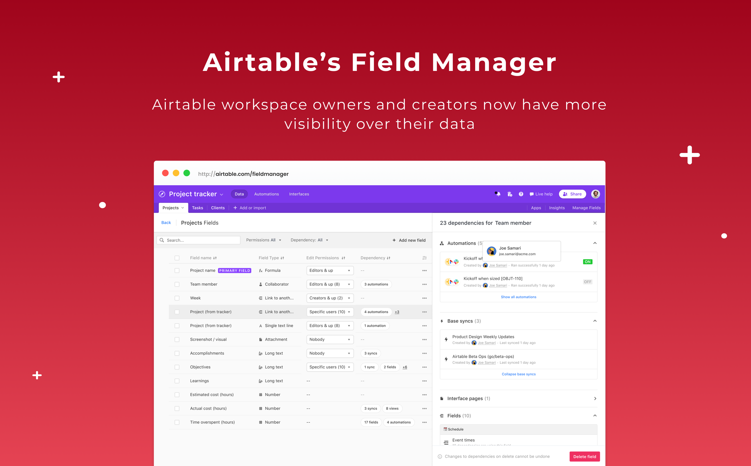
Airtable workspace owners and creators now have greater control over field schemas and visibility into field relationships, empowering them to make more strategic and informed decisions on both minor and major changes.

Airtable Entperise upsell opportunity
Research Insights
One common theme identified by our researchers at Airtable was “Making changes are scary.”
Users fear the potential consequences of field changes due to invisible relationships, which leads to time-consuming efforts to trace what broke—whether it's formulas, lookup fields, automations, or other elements.
To address this, I aimed to understand the complexity of field-to-field relationships. I focused on key questions such as:
What cascading effects result from a single change?
How deeply should users understand these cascading effects?
Why is it important to display this information?
When is the right time to show these guardrails to users?
Through this analysis, I identified various layers of dependencies and advocated for highlighting first and second layers of relationships—those that have a higher risk of breaking fields—to raise awareness and prevent errors.
Design Highlights
What’s our users mental model around data visualization?
I explored several approaches to surface field relationships within an Airtable base. The two primary directions were displaying all field configurations at once or organizing them based on specific view setups (e.g., list, kanban, grid).
To prioritize simplicity, we decided that showing all fields simultaneously would provide users with a clear, comprehensive view of their data, enabling them to grasp the big picture effectively.
Understanding field dependencies
Highlighting view dependencies was the core experience I designed for. My goal was to communicate field-to-field relationships, balancing simplifying but giving clarity, and if users understood “is this field safe to delete?”
The dependency graph evolved over time as I understood the data complexities, how users read their data, and what information could we surface from technical conversations with Engineering.
Outcome
Impact
This feature was delivered in early 2022 and ever since then, the team has seen a 25% improvement in task efficiency when making changes on the new field manager surface.
From community wise, we’ve seen customer praise across the Airtable community for this much needed feature.
